PlanIt


The goal of this project was to create an application that blends the academic and personal needs of a university student into one place. The result was a calendar that can act as an all-in-one inclusive app. Contextual Inquiry, Participatory Design, and Focus Groups were employed during the design process to offer us insight into what they needed, what they preferred, and what they felt was confusing or cumbersome with other similar apps. In the end, we concluded with 9 design recommendations to consider before continuing with future prototyping and usability testing.
Every student has their own way of managing time, either through third-party planning app(s) of their choice, post-it notes, or simply just remembering tasks in their heads. However, there never seems to be one that does it all for time managing veterans or one that offers enough incentives for outsiders to get into it.


Using the qualitative insights we gathered from our sessions with users, we were able to PlanIt, which offers:
PlanIt is more than just a calendar app, it combines beloved features from other productivity apps, including self-care reminders and the ability to import extern external calendars such as a course timetable.


PlanIt’s UI is designed to feel similar to other calendar apps so users don’t have to worry about learning curves, with the added benefit of more customizable features!
To better understand how university students manage their time, we conducted contextual inquiries and participatory designs with 3 University of Toronto students via Zoom. From these sessions, we produced the five work models for each participant and performed thematic analyses to help us generate and iterate our design recommendations. Finally, we implemented the recommendations into a functioning prototype that was tested in 2 different focus group sessions. The focus group analysis allowed us to arrive at the final 9 design recommendations that should be kept in mind in future design iterations before entering the usability testing stage.
Three recorded CI sessions were conducted with the three participants (one each). During the CI's, we asked each participant to show us how they manage their time as a university student.
Using the insights they shared, we came up with aggregated work models to outline users' mindsets, flows, and artifacts when managing their time as a student.

Based on the contextual inquiry session and the work models we generated, we conducted a thematic analysis to identify the key user needs.
Users like reminders.
Personal touch elevates the experience.

They value mental health.
Users appreciate flexibility.
After gathering insights from the contextual inquiry session, we came up with a few design sketches based on the themes identified in the thematic analysis.


Prior to the PD sessions, we came up with features based on information gathered in the CI's. We then invited the same participants to do scenario-based card sorting exercises given the following scenarios: viewing academic information, notifications, and organization.


Similar to the thematic analysis we did after contextual inquiry, we completed another analysis to further narrow down the needs of users.


To bring the users' ideal version of a planner to life, we incorporated key insights taken from previous research sessions and created a prototype on XD for focus group participants to try out.
During our focus group sessions, we uncovered some crucial issues related to unnecessary features and poor layout design.

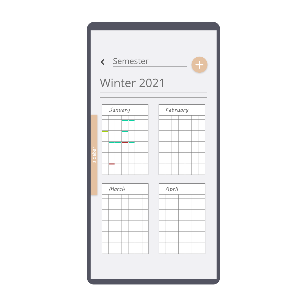
Removing Semester View
Many participants found the semester view confusing and unnecessary.

Tidying Up the Interface
Most participants appreciated the inclusion of various features, however, they also found the sidebar cluttered and confusing to navigate.
Using information gathered from our CI's, PD's, and focus groups, we came up with the following 9 design recommendations that should be kept in mind in future iterations.


