CineTix Movie Ticketing App


What is a typical movie-going experience like for you? Long queues? Having to wait at the front until your friends arrive because you booked everyone's tickets for them? CineTix is a mobile movie ticketing app designed to streamline the process of booking movie tickets along with features such as ticket-splitting and concession pre-ordering to tailor the experience to every user's needs.
To gain some insights into what the typical movie going experience is like, I interviewed 4 individuals and had them elaborate on the process they go through to book their tickets, with an emphasis on what works for them and what frustrates them.
Based on the interviews, I was able to gather the needs that users value the most:


I created a persona using insights gathered from the interviews. The persona represents the typical user who would do everything they can to avoid waiting in lines since they value time. Ideally, the typical user would want everything available in person to be available online as well.

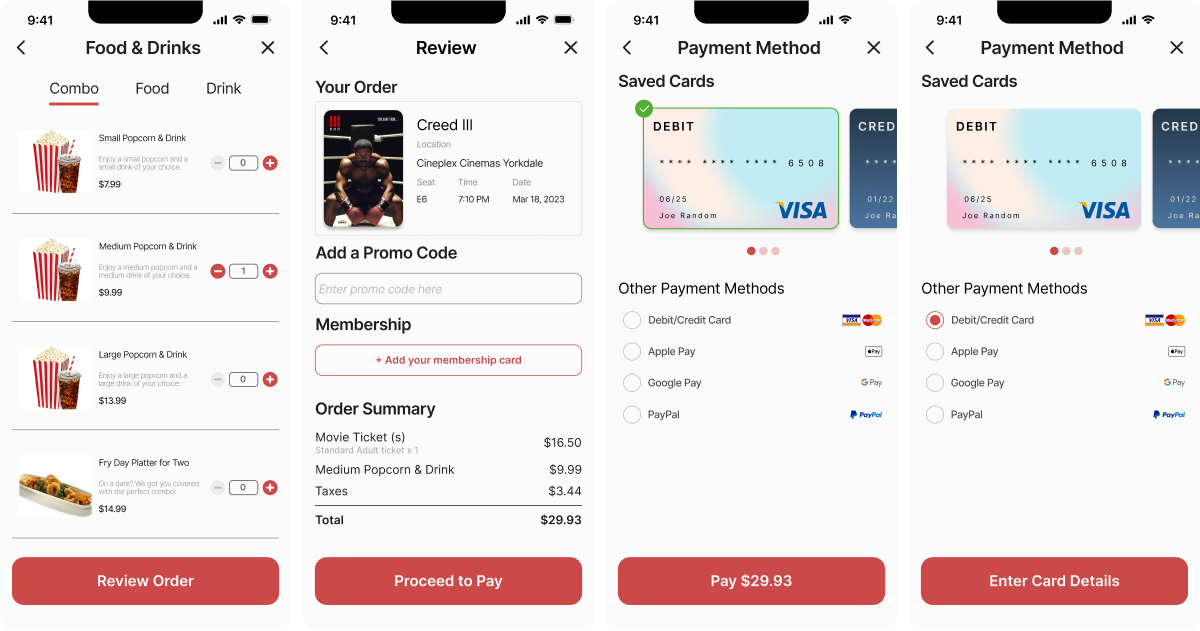
In order to keep the booking process linear, I decided that each screen should only be centered around a primary action or actions that are closely related to each other. I also attempted to reduce the overall screens needed to go through the whole process so that each step that the user takes to get to another step is simple yet meaningful.

I created a design system to ensure consistency throughout the high-fidelity mockups. I implemented a 4 column grid system to ensure even spacing and consistent placements for content. Secondary action buttons were introduced after several user tests to help distinguish primary action better.

Two usability tests were conducted via Zoom, where participants completed tasks that encompassed the main booking process flow. The first study utilized the low-fidelity prototype, and its findings aided in refining the initial iteration of the high-fidelity design. The second study took place after the initial iteration of the high-fidelity prototype, resulting in major changes to certain parts of the design to improve usability.


Due to the scope of the project, the newest iteration of designs has not been fully tested yet. I would love to conduct another round of user study with users who are not familiar with the app to get a fresh set of eyes on any usability issues.
Aside from basic functions, I would love to take a deeper dive into the personalisation potential this app could have. I also believe that a personalised system can help improve user retention, especially if users get to rate movies and write reviews, or a movie recommendation system based on user's genre preference.
Going forward, more accessibility considerations such as screen reader capability and language options can definitely be added to help make this app more user-friendly and inclusive for all.